Case Study: Fern Health
Reimagining Chronic Pain Care with Adaptive and Dynamic AI & Human Support
Transforming Fern Health’s product experience to reduce pain interference, increase engagement, and deliver emotionally intelligent care for people living with chronic pain.
Problem & Opportunity
Chronic pain distorts the nervous system and makes recovery more about management than cure.
Fern’s old experience lacked clarity, personalization, and emotional connection.
We saw a huge opportunity to reimagine everything, from first impression to long-term use.
Our goal: Deliver a warm, adaptive, and clinically grounded experience powered by generative AI and behavior change science.
What We Built
At Fern, we set out to reimagine chronic pain care. not just by reducing symptoms, but by building emotional trust, resilience, and daily support.
We designed a next-gen digital therapeutic that combines:
Real-time adaptive care plans
that evolve based on user input and progressA hybrid AI + human model,
blending conversational AI with expert coaches and cliniciansClinically grounded, behaviorally informed guidance
designed to drive real change
This approach lets us deliver care that feels personal, supportive, and responsive, meeting users where they are, every step of the way.
Metrics That Matter
Driving more meaningful impact delivered through a smarter, more human experience.
Reduction in pain interference (PROMIS) | 5%
5%


Uniting Voices Cross-Functionally
Increase in daily active use | 8%
8%
10%


Increase in intake completion | 10%
North Star & Leading Indicators
North Star
Reduce Pain Interference as measured by the PROMIS scale
Leading Indicators:
• Intake completion & care plan activation
• Daily active use & long-term engagement

This redesign was a deeply collaborative effort that spanned multiple disciplines. As the product and design lead, I worked closely to include voices from:
Clinical Content Team
Ensure that all personalized care journeys are aligned with evidence-based pain management strategies and met clinical integrity standards.Engineering Team
Integrate AI-driven decision logic, build conversational UI components, and modernize the app architecture to support dynamic personalization.Data Science & Analytics
Iterpret user behavior trends, validate hypotheses about drop-off, and inform AI training models for intake triage and content recommendations.
Product Development Process
Phase 1: Discovery
Phase 2: Solutioning & Ideation
Phase 3: UX Research
Phase 4: High-Fidelity Design
Phase 5: Dev Handoff
Phase 6: Testing - QA & Accessibility
Phase 7: Launch
My Role
Product & Experience Design Lead
• Lead organization with CTO and Chief Clinical Officer on next-gen design
• Identify key gaps, opportunities, and fixes
• Led full redesign across UX, visual design, and product strategy
• Guided and helped build a design system + AI-integrated care journeys
• Partnered cross-functionally to launch


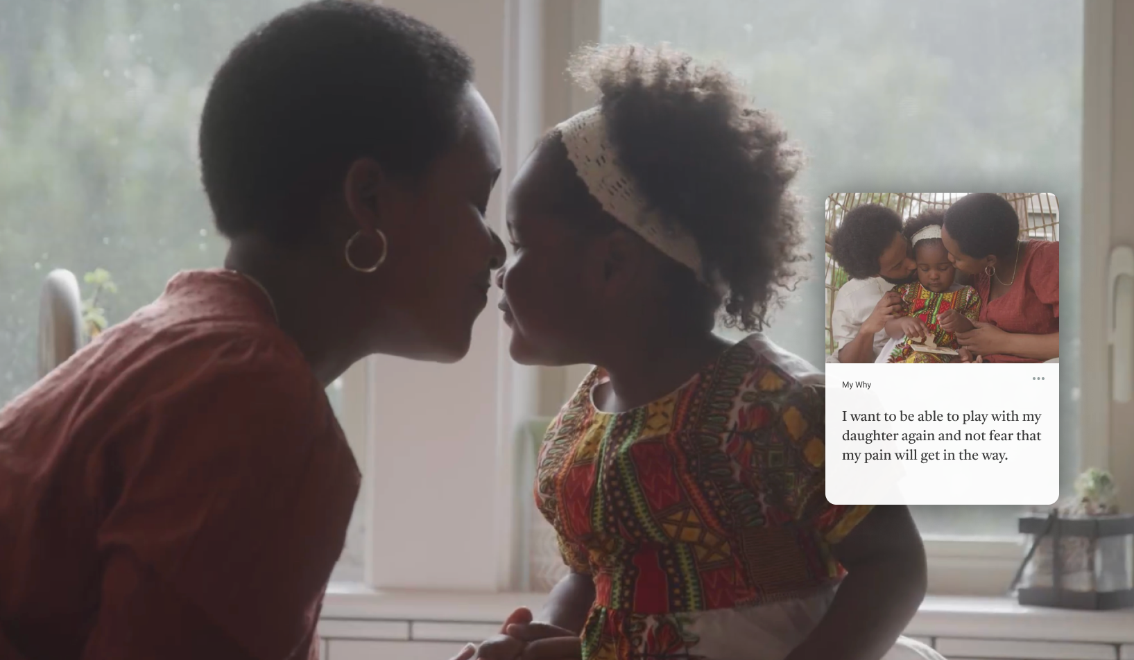
My personal “Why” for this project:
“This wasn’t just about optimizing for growth, it was about helping people feel seen, supported, and in control of their care again.”

Product Marketing
Reframe the pre-login messaging and ensure Fern’s value proposition came through clearly and emotionally in every touchpoint.Customer Success
Capture real user pain points and ensure the new experience addresses the needs of both high-touch and self-guided users.


Real Patient Voices
Continuous design experimentation grounded in real experience & aligned with business outcomes.
Our Patient Advisory Council became an integral part of the design process, joining us every two weeks to share honest feedback and lived experiences. Their voices reshaped our understanding of what meaningful relief looks like, helping us design a product that feels less clinical and more human one that empowers people to trust, engage, and grow through their care journey.
Process
Phase 1 Discovery
Phase 2 Solutioning & Ideation
Phase 3 UX Research & Validation
Phase 4 High-Fidelity Design
Phase 5 Dev Handoff
Phase 6 Testing - QA & Accessibility
Phase 7 Launch
Phase 1 | Discovery
Painpoints:
#1: Intake
Large drop off in onboarding, through user data and conducting interviews, users had a question burden from a long intake process.
#2 Daily Active Use
DAU was low, steady decline from intake through month 1, and a lack of personalization led to user churn.
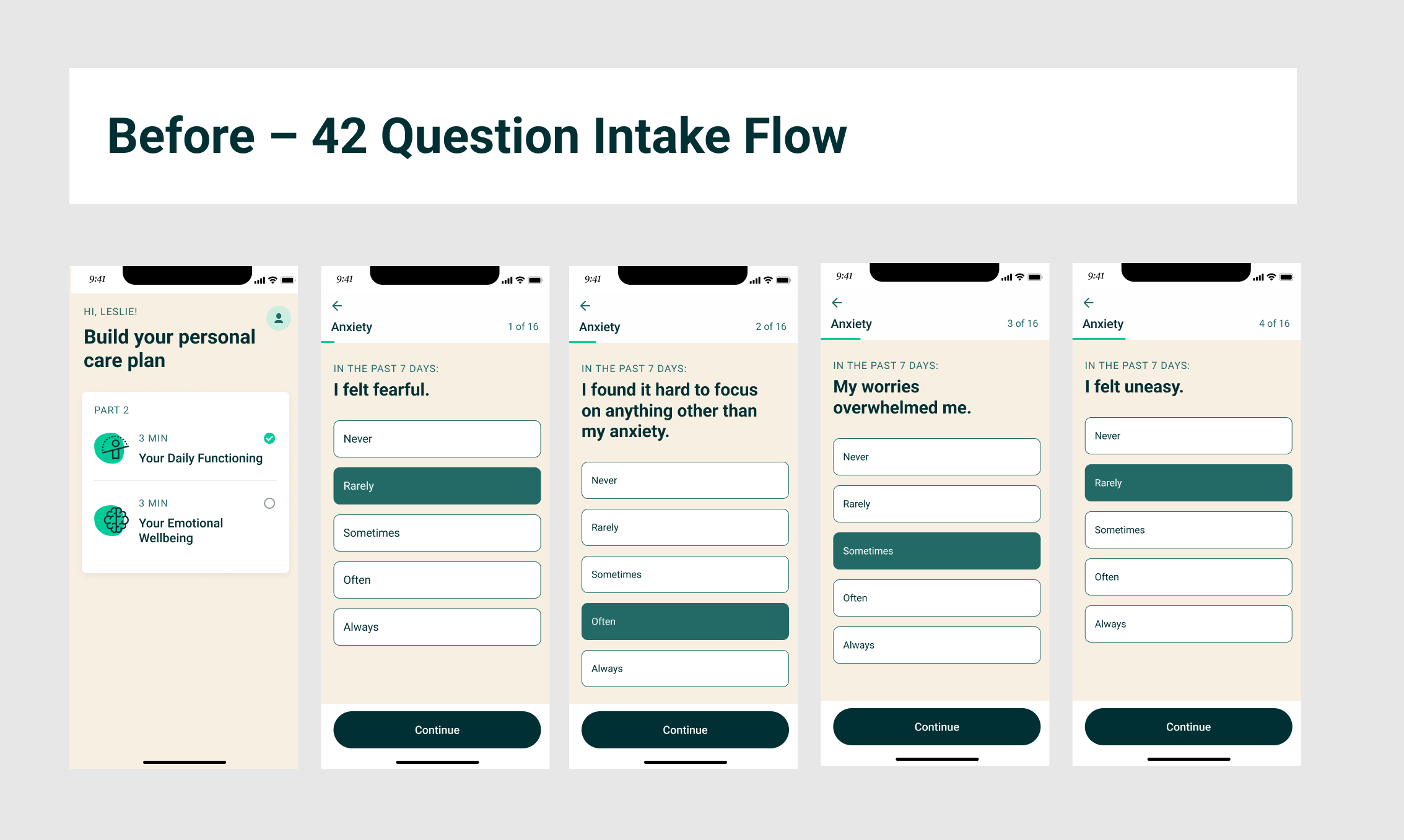
Pain point #1: Intake

👇 Intake Before: 53 Screens | 42 Questions !!!!
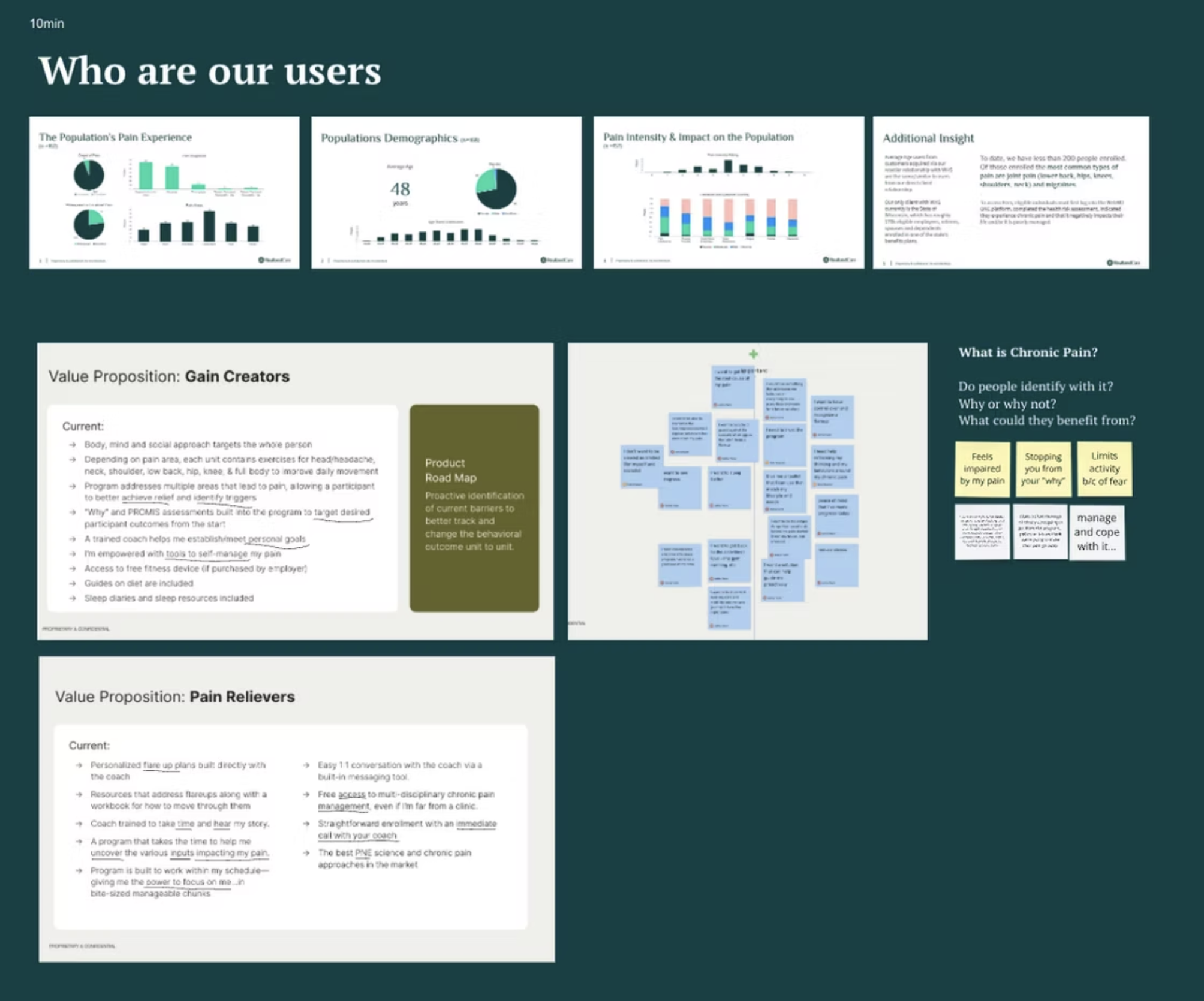
Finding the pain points & Internal Design Audit:
Evaluated the existing end-to-end user flow, focusing on intake, core engagement, visual design, and UX patterns for usability gaps and inconsistencies.
Data Analysis – Analyzed usage metrics, funnel conversion rates, and behavior drop-off patterns to pinpoint where and why users disengaged.
Competitive Landscape Review – Benchmarked Fern against other digital health and chronic pain platforms to identify opportunity areas in personalization, engagement, and tone.
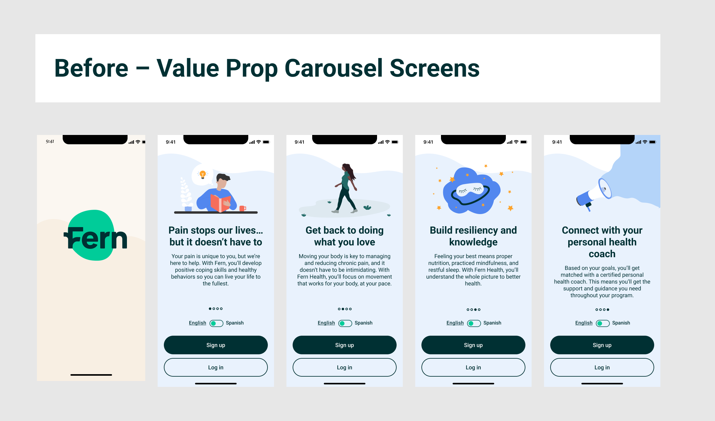
Before: Unclear messaging
Vague benefits: The carousel doesn't clearly articulate the specific advantages your product or service offers. It might use generic statements that don't explain how you solve a customer's pain points or improve their situation.
Feature-focused, not benefit-focused: The screens describe what your product does rather than how it benefits the customer. Users want to understand the impact on their lives or work.
No strong hook: The initial slide fails to immediately grab attention and communicate a compelling reason to engage further.
Before: Lack of feedback and dynamic content
53 screens before the user got to any value.
Zero feedback after the user was asked 42 questions.
High abandonment rates: Users are easily overwhelmed by the sheer number of questions and fields, leading them to give up before completion.
No feedback leads to uncertainty and anxiety: Users are left wondering if their submission was successful or if further action is required, leading to anxiety and uncertainty.
Increased frustration and impatience: Lengthy forms, especially those without a clear sense of progress, can become tedious and frustrating, negatively affecting user satisfaction.
Pain point #2: Daily Active Use
Desirability & Engagement
Despite a strong content foundation, users lacked motivation to return. The experience felt passive.
Design Requirements
Closed feedback loops to reinforce action and reward progress
Faster time-to-value in the experience, value must be felt early and often
Updated design system that supported responsive, accessible, and inclusive design across mobile and web
Before: Home Page
Low Engagement Loop
80% of the experience was static content
No incentive to return after completing a module
Open loops in core flows, with no feedback or progress reinforcement
Lack of Personalization
Every user received the same content regardless of their pain area or personal goals
No visible link between user input (like pain levels or preferences) and the program experience
No sense that their choices shaped their care plan
What the Redesign Needed to Solve
Human-centered voice & tone that felt empathetic and encouraging
Understanding each user's "why" for wanting to feel better, reflect back and coach them
A behavioral engagement loop built around core journeys and clinically grounded features
Personalized insights that closed the loop between user input and visible impact
Before: Module

Before: Progress & Insights
Phase 2 | Solutioning & Ideation
Solving Intake Feature Pain Point + DAU
We redesigned Fern’s intake flow to reduce friction, deliver value earlier, and build trust from the first interaction.
Before
Users faced 42 questions before seeing any value
High cognitive burden and long time-to-value
No feedback or explanation after completing assessments
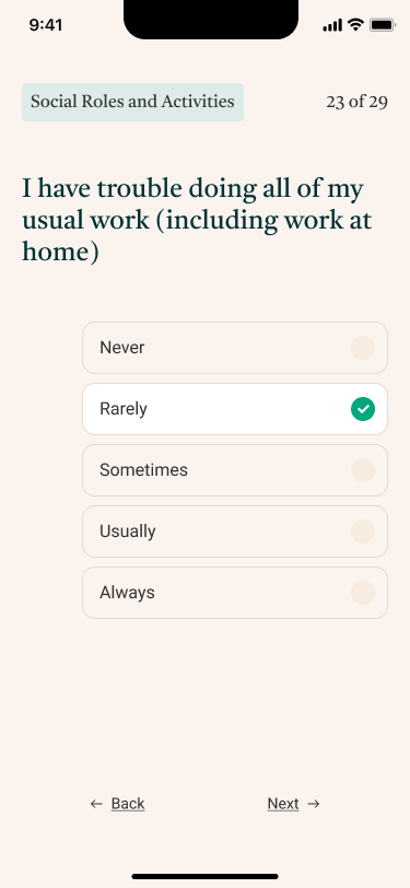
Intake After | Carousel + Intro Expectation Value Video & Customization, Empathy Reflection
Designing for Emotional Safety
Chronic pain is invisible, but its emotional toll is not. Many people suffer in silence, feeling misunderstood or dismissed. We knew from the start that our voice had to do more than inform, it had to comfort, validate, and connect.
Phase 2 | Solutioning & Ideation
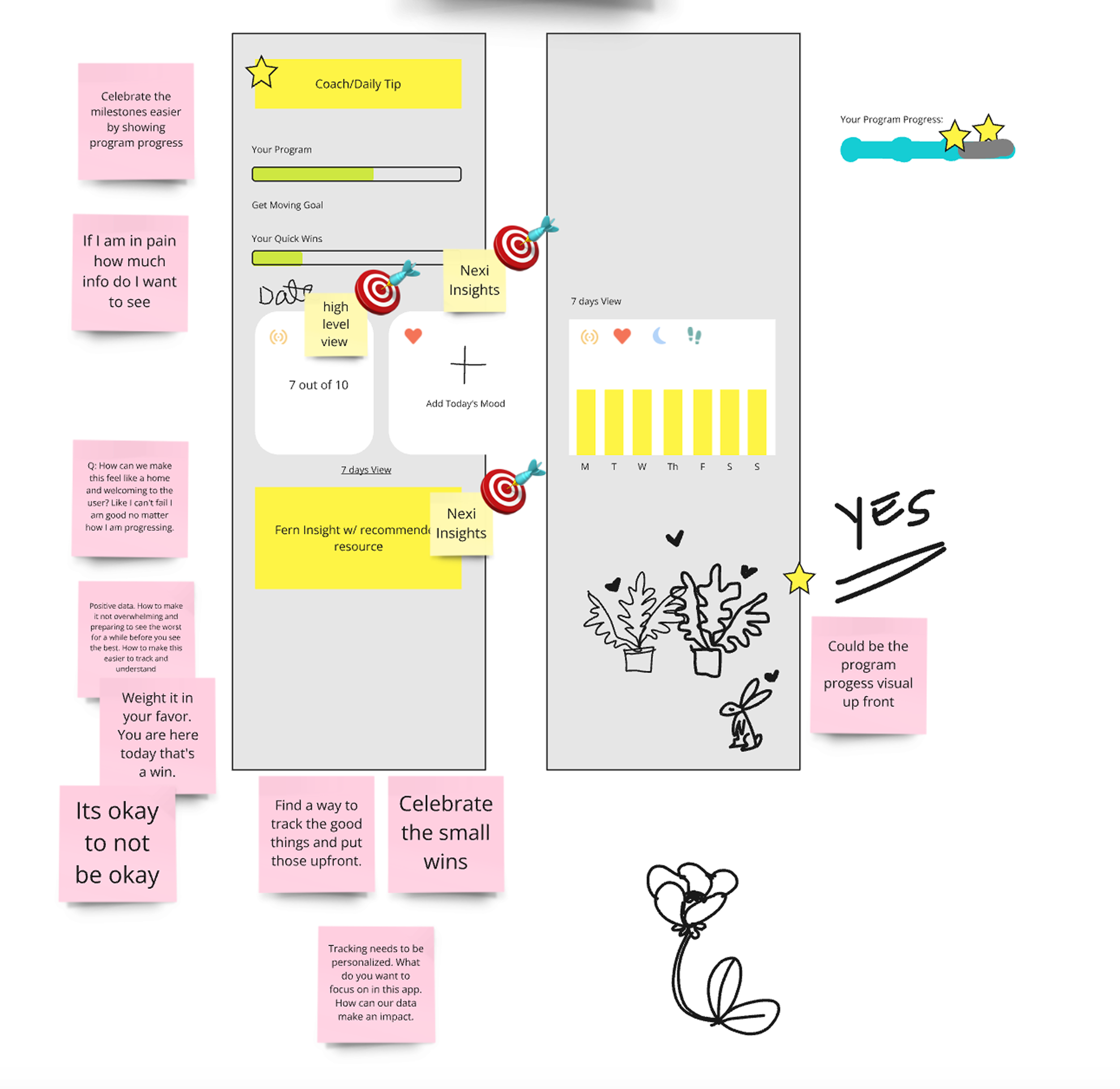
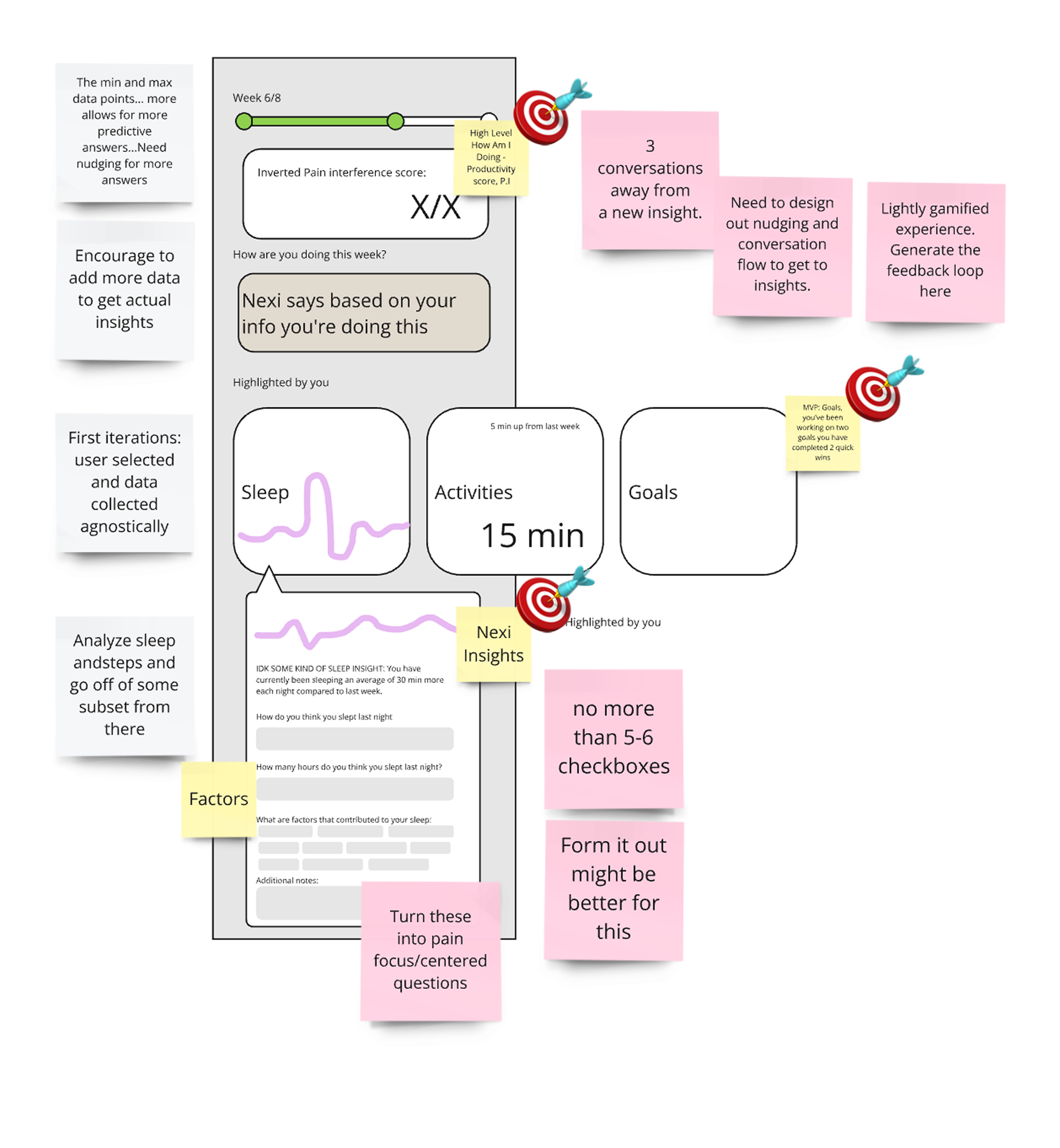
Insights & Progress Feature
We redesigned the insights experience to give users a clear, encouraging view of their progress, without overwhelming them.
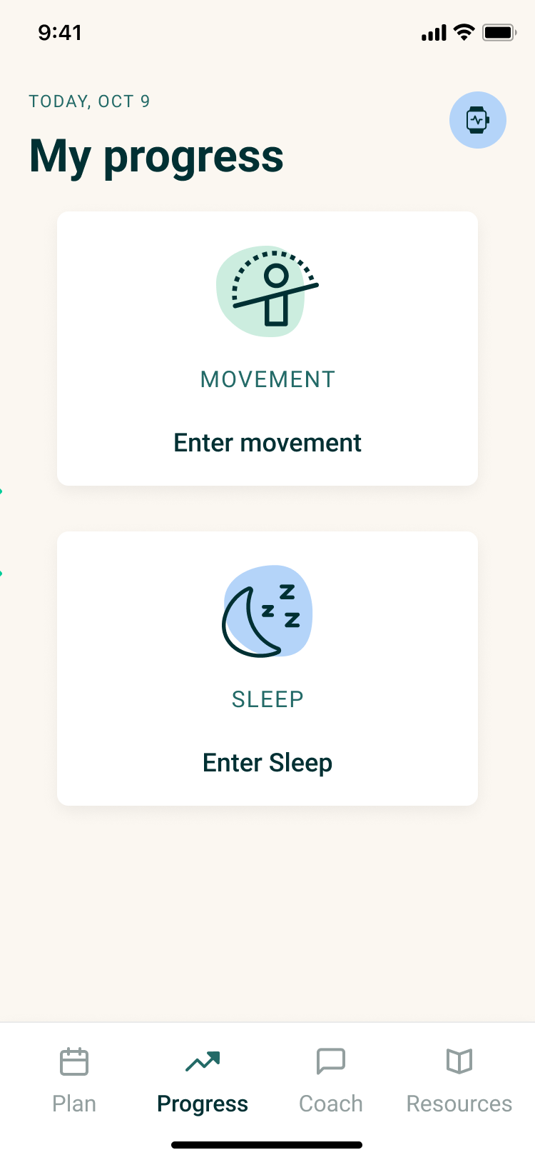
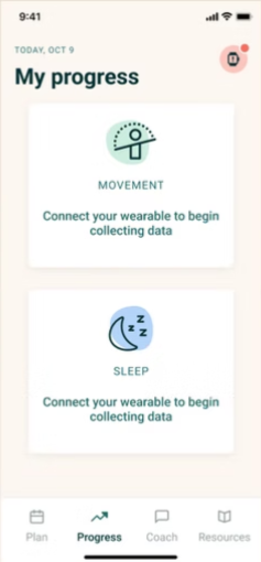
Before: Users saw limited and static metrics tied to wearable integration that was disabled. There zero feedback, minimal context, and no sense of emotional or behavioral momentum.
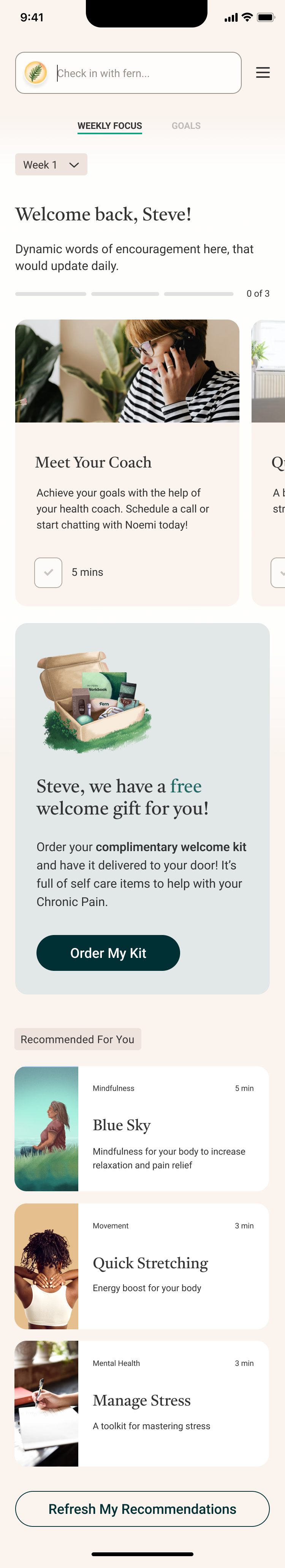
After: We introduced a dynamic dashboard that helps users feel informed, supported, and motivated to keep going. Visual progress summaries, like weekly time spent in the program or activity-based insights, promote positive reinforcement and curiosity.
Process: Insights & Progress Wireframes


Before:
Previously, the goal setting in Fern was something users discussed with their human coach, outside of the app. It wasn’t integrated, dynamic, or trackable.
We saw a clear opportunity to change that.
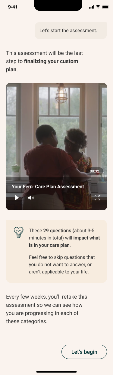
Intake After: Assessment Value & Expectation Video
Our Approach
Reduced question load and made onboarding more conversational
Introduced two explainer videos: one to set expectations, another to explain the purpose of the assessments
Clearly communicated time commitment and included progress indicators (like a completion bar)
Enabled SSO for faster account creation
Personalized feedback provided after each assessment
Personalized Care Plan


Our Voice Strategy
We designed Fern’s AI to sound like a trusted guide, someone who’s supportive, clear, and never clinical or cold.
We trained the AI to speak with
• Empathy and emotional intelligence
• Calm clarity, even during tough moments
• Encouragement without being pushy
• Intelligence that’s accessible, not condescending

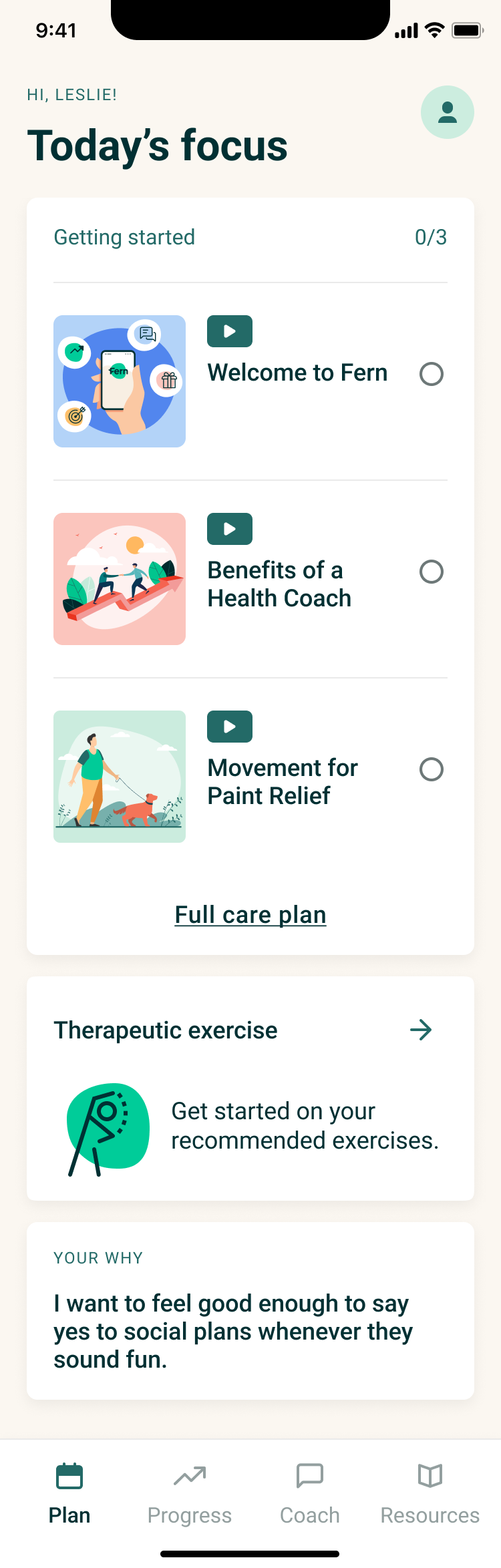
After
Users are engaged early, even before intake begins
Experience asks users about their goals and "why," fostering emotional connection
Users can choose their preferred tone of communication, leveraging AI to meet them where they are
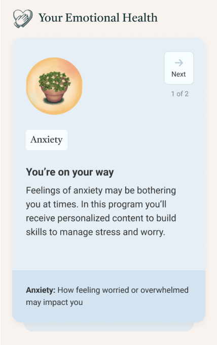
Intake data powers a dynamic backend system that auto-generates a personalized care plan upon completion

Intake After | Personalization & Why Setting


Home Page After: Dynamic Care Plan Each Week
Before: Progress & Insights Feature
After: Progress & Insights Feature

After: Smart, Personalized Tracking
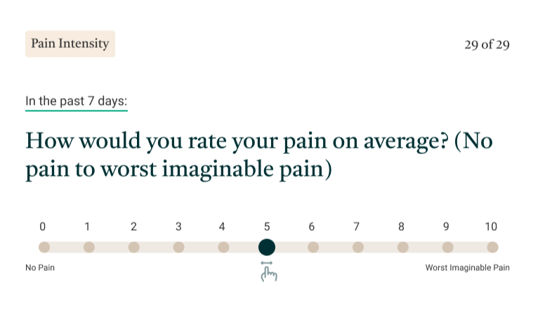
Fern’s AI continuously monitors progress using real-time data, pulling from wearables, goal setting, and user-reported outcomes (like PEG assessments).
When users hit a rough patch or slow down, Fern doesn’t just remind them to stay on track. It intelligently adapts their plan offering new activities or pacing adjustments based on what they need most in the moment.
Keeps the experience fresh and personalized
Helps users visualize impact across physical, emotional, and social health
Reduces long-term drop-off by showing real, relevant progress
Builds emotional engagement through feedback and encouragement
Phase 2 | Solutioning & Ideation
Insights & Progress Feature
How It Works
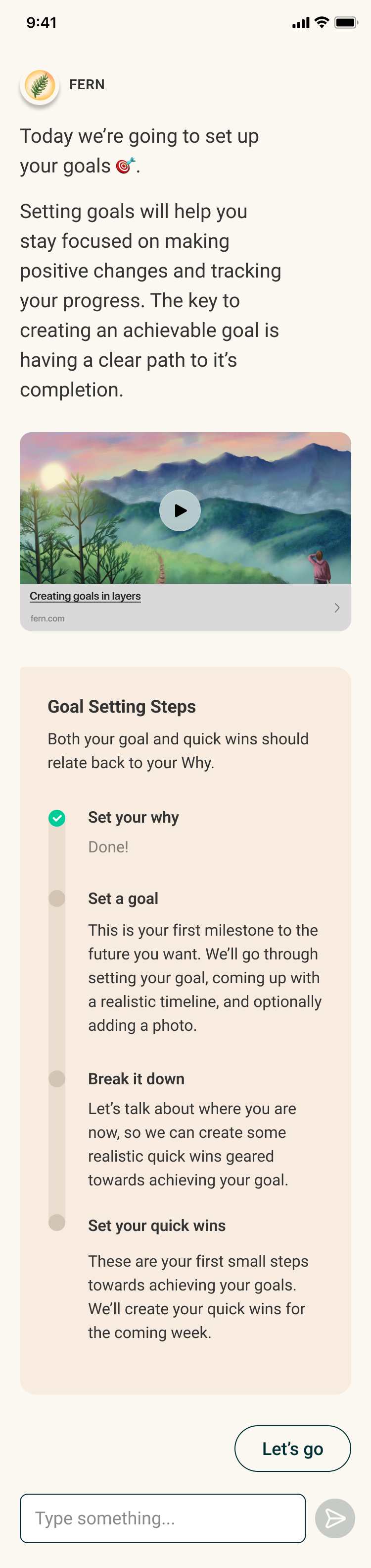
We grounded our approach in SMART goal-setting principles, but made the experience simpler and more intuitive through thoughtful UX and AI support. Users are guided step by step, from identifying their focus area to setting realistic goals and tracking progress over time.
This shift turned passive intentions into actionable steps, fully embedded into the care plan. It allowed users to move from wishing for change to working toward it, with Fern guiding the way.

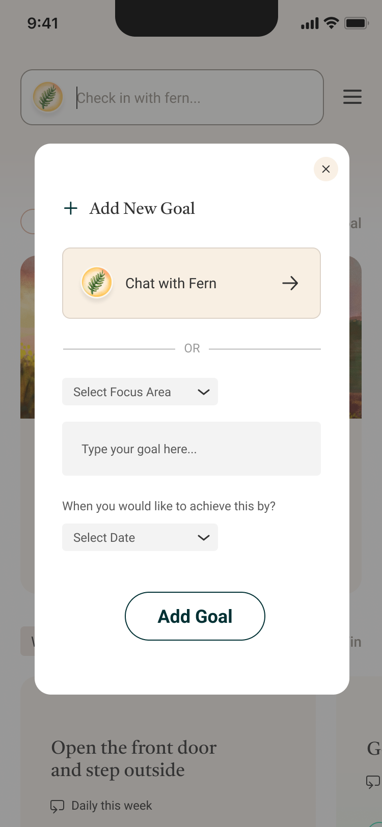
Goal Setting:
Tracking a Goal
What We Set Out to Do:
• Make goal setting a core feature within the app
• Design an interactive, AI-guided experience to help users define and achieve goals.
4. Set the Goal
Goals are made SMART by default
5. Break It Down
The system suggests “quick wins” users can do this week
6. Stay on Track:
Users can set reminders and adjust as needed
1.Set the Stage
An onboarding video sets expectations for the activity
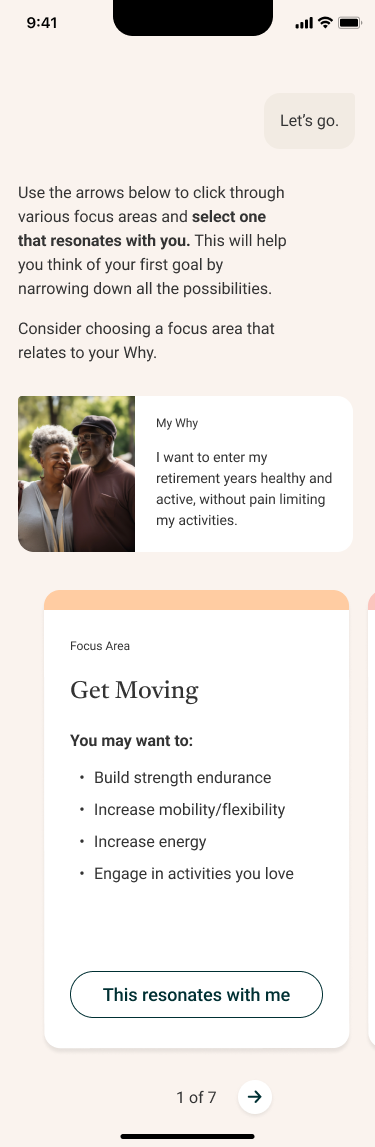
2. Choose a Focus Area
Users select what matters most (e.g., movement, mood, motivation)
3. Collaborate with AI
Fern helps define what’s realistic and achievable
Phase 2 | Solutioning & Ideation
Goal Setting Feature (Behavioral Activation)
Goal Setting: How to Create a Goal Introduction and Video


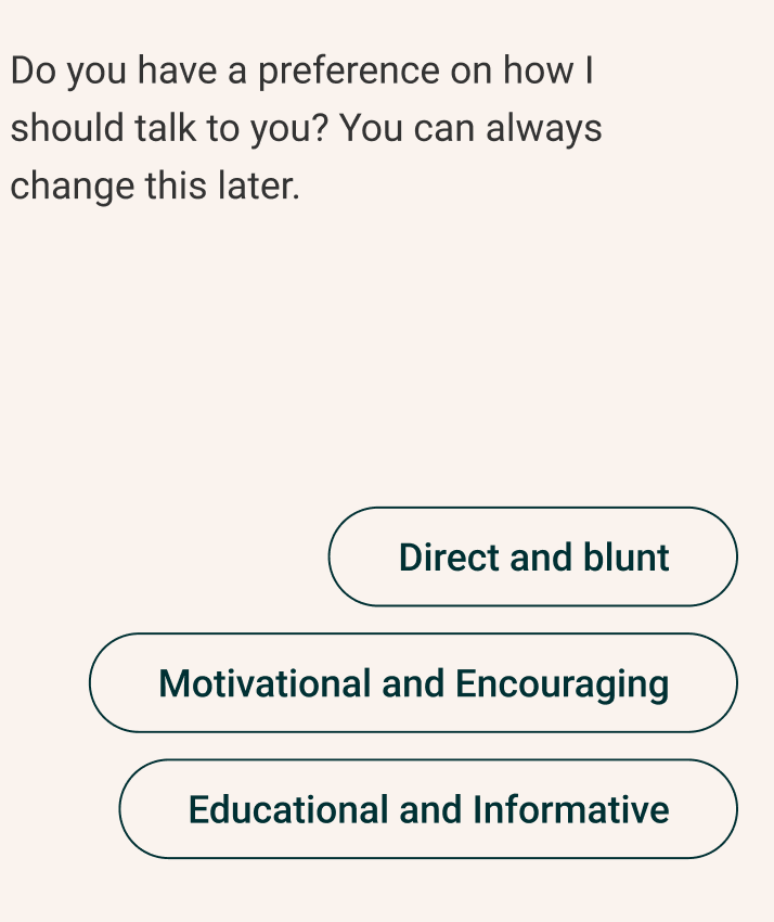
User-Led Communication
Everyone processes support differently. So we gave users the ability to choose their preferred tone of interaction right from the start.
Tone options
• Direct and Blunt
• Motivational and Encouraging
• Educational and Informative
Grounded in real experience
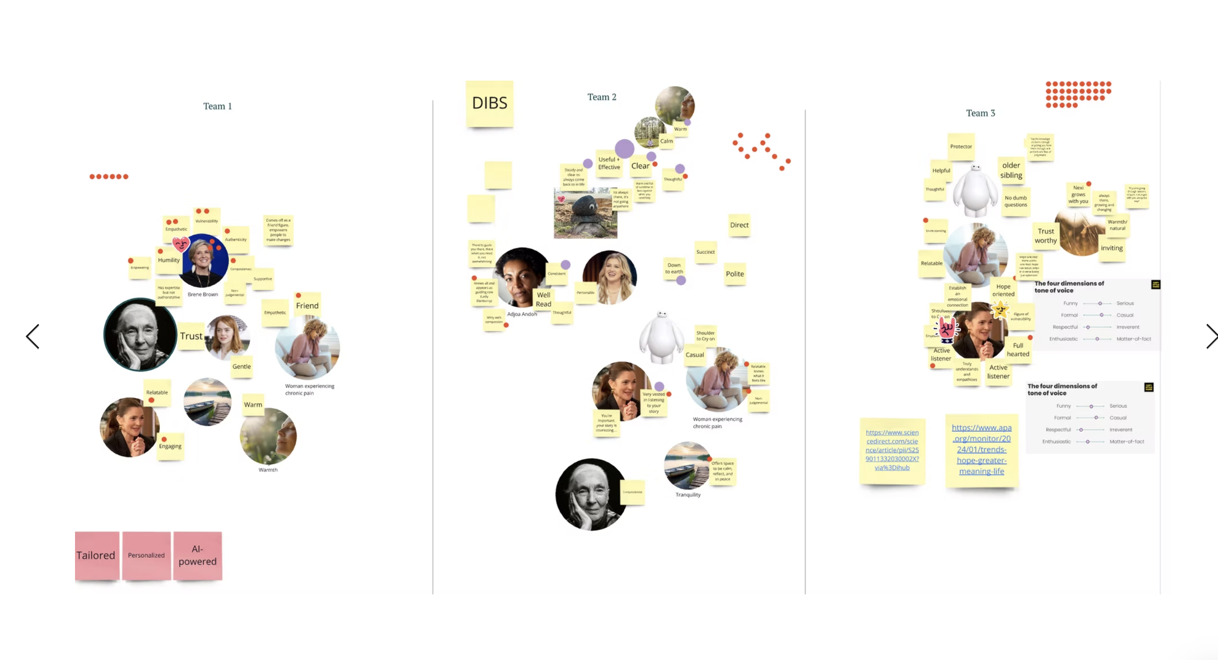
To get this right, we ran voice & tone workshops across teams, aligning on how we wanted Fern to show up emotionally.
“This helps me feel more in control and more comfortable opening up.”
- Lived experience patient of chronic pain
After: Progress & Insights Feature

Phase 2 | Solutioning & Ideation
Goal Setting Feature (Behavioral Activation)
New Feature: Goal Setting Journey
Goal Setting: Choosing a Focus Area
Goal Setting: Prototype Testing
Goal Setting: Wire Frame Glamor

Voice & Tone Workshop


Goal Setting:
Adding New Goals
After: Personalized Assessment Feedback


Phase 2 | Solutioning & Ideation
Voice & Tone of Product
Tone Personalization
Phase 2 | Solutioning & Ideation
Insights & Progress Feature
Phase 3 | Research & Validation
To ensure the product was not only functional but truly impactful, we ran a comprehensive research phase focused on usability, emotional resonance, and implementation confidence.
We combined qualitative research with continuous prototyping to guide the entire design process.
Prototype Testing
Created and tested early prototypes to surface friction points, gauge emotional reactions, and validate overall desirability. Sessions were moderated with target users to observe both behavioral and emotional responses in real time.
Usability, Comprehension & Desirability Testing
Assessed how easily users could navigate flows, understand content, and connect with the product emotionally.Co-Creation & Feedback Loops
Collaborated with users, coaches, and clinical experts across multiple iterations to ensure the experience felt supportive, clear, and grounded in real-world needs.Technical Feasibility Testing
Partnered with engineering to test and refine key flows early, so we could move into implementation with confidence.
Phase 4 | Hi-fidelity Design
Focus Recap:
Onboarding refinement
Intake flow redesigned to be warm, conversational, and value-driven from the startDriving daily engagement (DAU)
Surface the most relevant content and actions, tied to a user’s goals and progressPersonalized, dynamic dashboard
Adaptive modules that evolve based on real-time data and behavioral signalsInsight delivery
Clear, meaningful summaries that drive action, memory recall, and emotional reinforcement
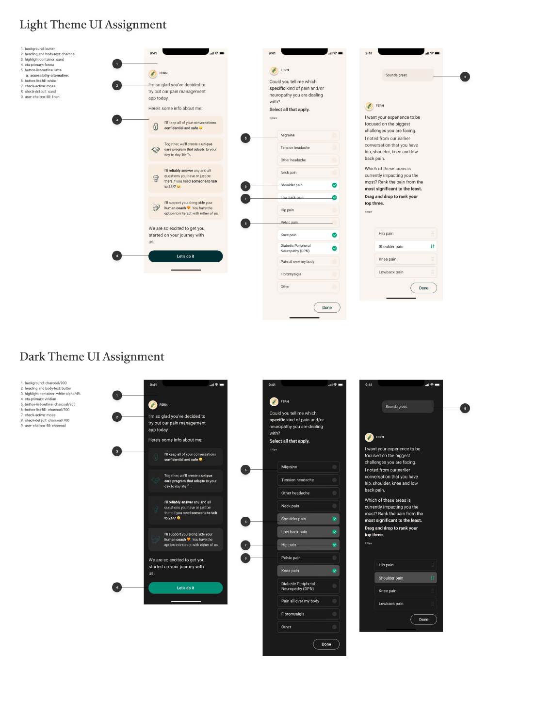
Design System & Consistency
To ensure speed, scalability, and cohesion across the experience, we built a flexible componentized design system:
Reusable UI components across intake, care plans, and insights
Consistent interaction patterns to reduce cognitive load
Modular layouts supporting both AI- and human-delivered content


Phase 5 | Developer Handoff & Implementation Readiness
To ensure the redesigned Fern experience was not only beautifully crafted but also buildable, trackable, and scalable, I led a comprehensive handoff and QA process that included:
What We Delivered:
Fully spec’d Figma files with reusable components and style documentation
Design system guidelines covering interaction states, spacing, and patterns
Clear documentation of edge cases, error handling, and responsive behaviors
Slack + Jira integration to support sprint-aligned handoff and async dev support
By investing in a well-organized design system and anticipating edge cases, we reduced ambiguity and accelerated development.


Data Strategy & Event Tagging
We partnered closely with data science and engineering to make sure user behavior could be tracked and measured from day one.
Key Steps:
Event Mapping Workshops to align on the most meaningful UX moments
Journey-based analytics plans tied to user goals (e.g., completed intake, started care plan)
Structured event schema in Mixpanel/Amplitude with clear naming conventions
Funnel and drop-off dashboards to monitor post-launch behavior
A/B test setup for experimentation and optimization
This foundation gave us confidence not only in what we were building—but how it would perform in the real world.

Phase 6 | Testing: QA & Accessibility
To ensure a smooth, stable, and inclusive experience at launch, we partnered with our QA team to run comprehensive testing across visual design, UX behavior, content tone, and accessibility. This process helped us catch issues early and gave us confidence in the product's readiness for real users.
What We Tested
• Visual QA: Reviewed staging builds to catch pixel misalignment, spacing inconsistencies, font issues, and overall design fidelity.
• UX QA: Verified navigation flows, tap targets, animation timing, and state transitions to ensure they matched the intended user experience.
• Content QA: Audited copy for clarity, consistency, and emotional tone—ensuring everything aligned with Fern’s voice and supported the user emotionally.
• Accessibility QA: Checked contrast ratios, keyboard navigation, and screen reader support to ensure the product was inclusive and WCAG-compliant.
Phase 7 | Launch
We launched the redesigned Fern experience with a focus on impact, engagement, and clinical alignment. While the release was limited in scope due to Fern’s acquisition, early results were promising.
Outcomes
5% reduction in pain interference (as measured by PROMIS)
Increase in daily active use, signaling stronger engagement and retention
Positive qualitative feedback from users who felt more supported, seen, and motivated
Context
This launch was part of a limited pilot and not commercialized at full scale due to the timing of Fern’s acquisition. Still, the results demonstrated clear product-market fit, validating both the clinical model and user experience strategy.
Fern Health:
A design system built for empathy
Discover the incredible work my team and I crafted to bring Fern’s user experience to life.

Process Gallery
Fern Next Gen Voice & Tone Workshop
Fern Next Gen Voice & Tone Workshop

Critical User Journeys
Fern Next Gen Voice & Tone Workshop
Tools Used:
Figma
Used to design the new end-to-end product experience, from onboarding flows and conversational UI to responsive components and accessibility-ready screens. I also built a fully scalable design system in Figma to support consistency and handoff across web and mobile platforms.
Miro
Used for early-stage workshops, journey mapping, and cross-functional collaboration. Helped align product, clinical, and engineering stakeholders around the user pain points, future state vision, and prioritization of redesign initiatives.
Jira
Used to manage the product development lifecycle, from ticket creation to release planning. I collaborated with PMs and engineering leads to break design work into sprints, track dependencies, and ensure smooth handoffs and implementation.
Adobe Illustrator
Used selectively to create custom iconography and visual assets for the new design system. This included illustrations that emphasized calm, agency, and emotional safety, critical to Fern’s new brand voice and therapeutic goals.